(NOTE: this is not a real business, just a hypothetical situation.)
Company Materials:
Further expanding upon my Business Plan, I needed to start making marketing materials to help me advertise myself and subsequently gain business. The three main materials I need to produce are a Logo, a Business Card, and an Invoice.
An example of a logo that is synonymous with its product is the Coca Cola logo, almost as famous as the flavour itself.

Logo Design:
A logo is a graphic mark or symbol, which is used by organisations to get the public to easily identify their products and services, with the following factors being taken into its account when its being designed:
- Convey the history of the business.
- Be used in on many different forms of media.
- Be easy to understand and memorise.
- Colour and shape.
- Its purpose.
- Your target audience.
- Why it is needed?
- Be timeless.
- Work in black and white.
- Impressive and Seductive.
- Keep it Simple
Now that I had established some traits a logo should exhibit, I decided to use the two examples from my business plan and see if their subsequent logo’s showed off any of the previous points.
Business 1: Love through the Lens Photography:
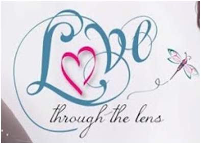 First off the Logo is simple and readable, creatively replacing the O in “Love” with a heart, with a font type that gives the impression its hand written, further emphasising the love and attention which goes into their work. It’s easy to remember, While being seductive enough to make you want to further explore its works. Due to the nature of its design it definitely seems to aimed more towards a feminine audience, even though what the company does is a multitude of things.
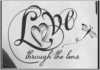
It also works in black and white:
Business 2: Studio Shotz

As opposed to Love through the Lens, Studio Shotz have gone for a far more practical logo design, in bold black and white to act a stamp to let you know they mean business. The use of the inverted “Shotz” part of the logo gives contrast and draws the eye, with the black square acting as frame, tying in their business into the logo. The fonts are easy to read, with the main information in a different font so it doesn’t blend in with the rest of the logo.
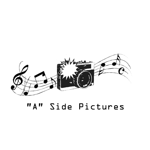
These two gave me some rough ideas to work with, I decided my logo needed to exhibit both photography and music related imagery, as this would convey what type of business it is, or its purpose.
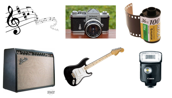
Immediately I gravitated towards the idea of using the music stave as a form of film roll, as they both exhibited similar qualities as they both record the events of their respective media, and would be easily identifiable by my target audience.
So with a little artistic license, I created the above logo for my business. I chose to keep it simple by only using two colours, which would mean printing costs wouldn’t be as expensive, plus make it usable on multiple different forms of media easily. In black and white it also acts a stamp for my business, looking professional and could potentially stay in its current form for the duration of the business’s existence, taking inspiration from Studio Shotz.
The name of the business works well with the design too, as the “A” side of a single would usually contain the song the record company where trying to promote, and since my business is trying to help musicians and the like more recognition, works well with the imagery.
 Business Card:
Now that my logo was created, I moved on to using it on a business card, a common device used during formal introductions to help potential clients remember the services the business offers and how to contact them in the future.
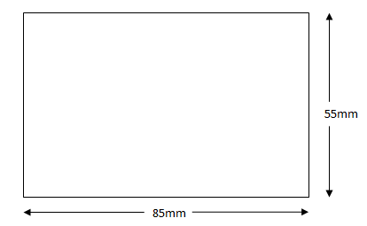
Business cards usually about the same size as a credit or debit card, measuring 85mm length x 55mm width, with information being displayed on either one or both sides. The benefits of having information on both sides means that there is more space for the information to be printed, but may cost more to produce, while having only one side printed means that its cheaper, and gives the option for the client or person associated with the business space to write any additional information specific to that client.
These cards can range from being multi-coloured and heavily decorated graphic statements, or plain and simple factual devices, but the most common features business cards exhibit are:
- Name of the person associated with the business, giving the card.
- Name of the business.
- Company logo.
- Company Tag line or motto.
- Telephone number (both mobile and landline.)
- E-mail address.
- Fax.
- Street address.
- Web address.
- Social media address (Facebook, Twitter, Linked-In)
Like before, using the list above, and some examples of different types of business card, I then broke down the strengths of each one.
Market Research:
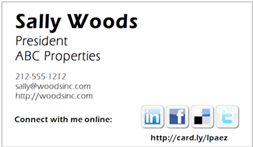 On this example, it keeps it simple, a one sided card with 2 main colours and 3-4 spot colours. This card doesn’t have a logo, or a street address, focusing more on the individual giving the card than the business overall.
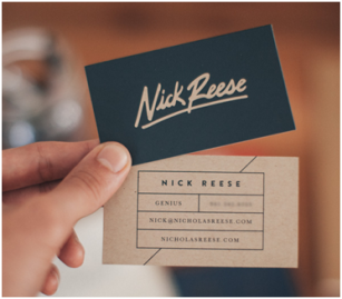 On this card, the designer has gone for a two sided design, and has put a bit more thought into it aesthetics. By having just the name on the front, it allows the designer to put more work in the logo, making it stylish and imposing, while having the information on the back.
So for my design I’ve decided to create mix of the two about designs, pictured below:
Front: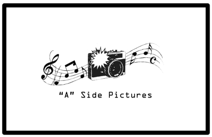
Back:
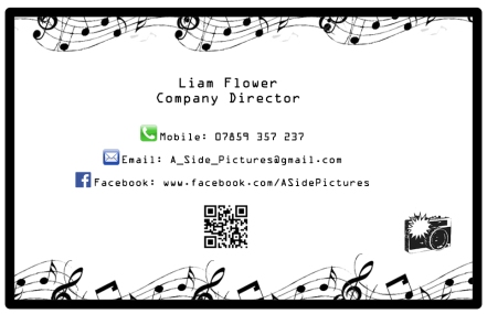
By keeping the information brief, it makes the card look more professional, while only putting the phone, e-mail and Facebook information, makes it easier to identify and to remember. Keeping with the black-white contrast of the logo, not only does it make it cheaper to print, with the exception of the spot colours, but also means that it is easier to read as none of the colours are similar, so don’t blend together.
Invoice:
Now I had some promotional material for my business, I now needed to make an invoice. An invoice is a commercial document used between a business and their clients and usually contains the following sections:
- Logo.
- The services or products that have been sold, so it’s clear what has taken place.
- The quantity, of the said services/products, so the buyer knows how many services they is paying for.
- The price of each item, plus overall cost, including transaction fees and other payments, so the buyer knows how to pay.
- Name and Contact Details of the person buying the goods, so the business can contact them further if any changes’ occur or need to contact them further.
- Name and Contact Details of the person selling the goods, so the buyer can contact the company if they have any addition queries.
- The Date the Invoice was Issued, plus what date the payment is due, so both parties can keep a copy as part of their financial records.
- A Invoice Number, so the business can easily identify who they have done business with, and which specific service or product has been sold.
- To who and what account the fee should be made payable to, etc. sort code and account number.
I then looked up some examples:

Both Invoices contain many of the above points, though the overall layout remains the same, following a very linear format to make understanding the invoice as simple as possible, something I have used as a guide for my invoice. (See attached Invoice)
The way they do this is by starting with logo of the business, plus having the word “Invoice” to denote who it is from and what has been sent.
Next they follow with the address and important details such as the invoice number, date it was issued, etc along with the recipient address so immediately they can identify that it is for them and have key dates showing when it was sent and potentially when its due.
What follows is the Inventory List, showing clearly showing what products or services and of what quantity, with a brief description of what was ordered, with the cost of each individual service or product. This is then added up in a total cost section for each item, before a sub-total and total payment section is presented with the figures already calculated, plus VAT or tax.
Finally the information about how to pay the payment is presented, either in the form of a bank transfer in the case of example one, or the payment has already been made in the case of example two.
On my invoice I have followed the above layout, but also added an alternative payment method, being by cheque, which also allows me to put a business address and phone number, giving the client a way of contacting the business about any further queries or payment methods. I also added an additional notes section, allowing miscellaneous information specific to the client to be added to the invoice.
Questionnaire:
Now I have created some promotional material for my business, I now need to create a marketing tool to help get some information back from clients and the public so I know what areas of the business I can best develop.
The idea of a Questionnaire is to acquire a lot of information quickly, where standardised answers allowing the researcher to easily see correlations in data in order to make judgements. It makes sense for a business to use this method as it cheap to create and distribute.
Questions put on the questionnaire need to follow some of the basic rules laid out below:
- Having statements which are interpreted the same way by different subpopulations of the target audience.
- Have statements which people with different opinions will give different answers.
- Each question must only address one piece of information the researcher wants to receive.
- Use positive statements, rather than negative ones.
- Don’t make assumptions about your target audience.
- Not be biased towards a certain answer.
My Questionnaire is going to focus on trying to gather information on how much, what age and genre demographic, are willing to pay for a particular outcome, as well as asking them if they have had any promotional material before and if so, if they were satisfied, and what the end result took the form off. (See attached invoice.)
They also have an incentive to fill out the Questionnaire by adding at the bottom that they will be entered into a prize draw where the winner will receive a free photo-shoot which will be displayed on the Businesses’ website and Facebook Page. Not only does this then promote the group on various media, but acts as marketing material for the business too.
These questionnaire’s could be mailed out to existing customers with their invoices, as their details have already been acquired, or to a select target audience with a free post envelope, or filled in only on a survey website, such as Surveymonkey.com.
By numbering the multiple choice answers, the answers then have set values, which can then be entered into a spreadsheet to create charts and graphs that can be used to measure the required result.

For example by correlating the amount of people who had previous promotional work to satisfaction level, we can see that only 8% where satisfied.
References:
http://www.1stwebdesigner.com/awesome-rules-designing-perfect-logo/
http://www.dorsetportraitphotography.com/
http://studioshotz.co.uk/


